

Dr Popper – Reskinning an iOS Game
 Earlier in the year I was contacted by an old friend to see if I was interested in re-skinning a game that he had created for his employer. The game was called “Dr Popper” – and as you can probably guess it’s a bit like Candy Crush on steroids (quite literally!)
Now I’d sort of retired from doing game art, because the art side of game development just isn’t viable for me any more (basically, I need to earn more than £1.20 an hour). But this was an opportunity to work with an old friend, so I decided to do it. It’s interesting to note that the coder, musician and artist (me) first worked together 23 years ago. What a bunch of old gits…
 Initially I figured the job would be straightforward. You are working with an existing set of graphics after all, so you therefore have some idea of the quantity of artwork you need.
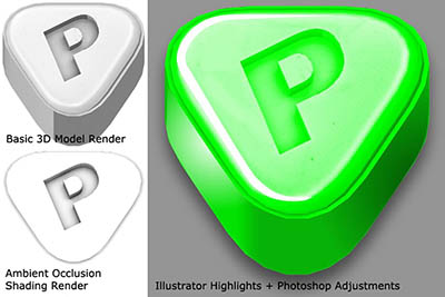
As the budget was very tight on this project, I opted to do as much work as possible in Adobe Illustrator. That is, using vectors as opposed to pixels. Now I have to be honest, I have a love / hate relationship with Adobe Illustrator. Every time I start to use it on a project, I hate its stupid interface which is just way too small, and doesn’t give you enough visual feedback (I bought – and still use CS5 by the way). I hate the fact that it just doesn’t do basic things – allowing me to round off vertices (sorry, ‘anchors’). But towards the end of a project, when I’ve gotten used to all its ‘quirks’, I start to like it. It’s just a shame that it has too many quirks to remember between uses 🙂
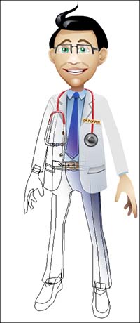
So the game art was created in vectors (like the geezer on the right). And towards the end I was impressed at the speed at which 2D art could be created with vectors. I went on to add texture to some of the game art, and that really helped add depth and detail to elements that really were quite simply constructed.
I wanna play a game….
But there are drawbacks to working with existing graphics sets. And those drawbacks mostly revolve around tile sets! Anyone who has ever worked with sets created by somebody else knows just how cryptic they can be. It’s a bit like working with a vast multi-layered jigsaw puzzle – there is a lot of reverse engineering to be done!
One of the Dr Popper sets was actually orthographic 3D, so you had graphical elements that needed to overlay each other. That caused me to swear a lot. In the end, I found the best way to update the tile sets was to use Photoshop Action Scripts. I basically isolated the most basic art elements (the inner and outer corner pieces) then recorded the process of cloning them out to recreate the the original tile set.
(Yes, I still use Photoshop CS4. Get over it! :D)
This meant that I could update the main corner art, then run the Action Script so that the changes iterated out into the tile set. It was a bit clunky, but it worked! I recommend this approach.
Adding Texture
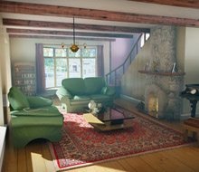
A year or so ago, I played a game called Signal to the Stars. The style of that particular game really stuck in my mind, solely because of the mix of vector-based art with layered texture. I decided to try and take that approach with this particular game. Below is an example. The background image on the left was created using a combination of 3D Studio, Adobe Illustrator and Photoshop:
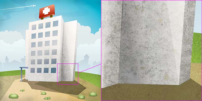
I know that sounds like a long-winded process for a basic background image, but it isn’t. I created the simple structure of the building as a 3D model and produced a basic render to show how the light would hit the surfaces, and where the shadows fell. I then used this rendered image as a guide for an Adobe Illustrator vector drawing. The Illustrator drawing contained all the details – the colours, gradients etc. Finally, a high resolution version of the Illustrator image was exported to Photoshop. And in there, I added texture to the image.
 The more I did this, the more I realized that actually, the result is on a par – and sometimes better – then when you UV texture map the 3D model. The eye doesn’t really see that the texture isn’t wrapped around the object, it just sees texture. And because it isn’t distorted, or filtered, the image is nice and clean.
 The only down side to creating game art in vectors that I found, was that it was sometimes all too easy to add in detail where it wasn’t needed. For example, I’d find myself adding shading into window recesses and things like that – only to find that those were reduced to nothing in the final game art. What can I say, I’m an idiot! 🙂
One thing I do actually like about Illustrator, is the fact that you can place imagery outside of the canvas area. That’s a big advantage over Photoshop. It’s great to be able to position reference imagery around the image you are working on. The other cool thing is, Illustrator picks up on changes to any external images – and brings them in. Photoshop doesn’t. Well, Photoshop CS4 doesn’t. Maybe the new version does?
Another very useful Illustrator feature is the Edit Colors > Recolor Artwork tool. If you haven’t already used that, I suggest that you try it out. If, for example, you are working on a vector image and aren’t too happy with the colour scheme you have chosen, the Recolor Artwork tool will actually analyze your colours and remap them into themed colour sets. I thought this was a brilliant tool, which enabled a lot of colour experimentation. Something that I previously found very difficult with vectors (due to the palette indexing).
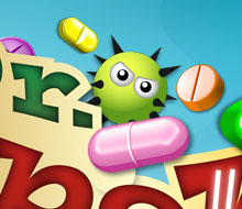
Nurse, my PILLS!
Finally a quick note on the tablets themselves. We decided on a ‘look’ for the pills at quite an early stage by modifying the contrast levels and colours of the original placeholder art. It was then a case of creating new ones to that spec.
They were created using a combination of 3D Studio, Photoshop and Illustrator. I created the basic shape of the pills as 3D models and set up the lighting to try and show as much of the shape as possible. I then rendered out an Ambient Occlusion shading image to enhance the shape further. Those 3D renders were then combined and edited in Photoshop. The colour was also added at this stage.
Finally, I moved the pill graphics back into Illustrator for a final layer of shading and highlighting enhancements. This gave them a more cartoon-like appearance. Who would have thought you would need to go to so much trouble for things that appear so small on screen?
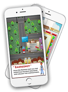
I’m not sure when Dr Popper will be released, but if you’re into match-3 games, be sure to keep a lookout for it on the iOS store. Be warned though, it is a very addictive game…
Dr Popper Video Game
- Categories →
- Animations
- iOS | Android Games
- Logos
- Photoshop
Portfolio
-
The F2 – Target Tekkers

-

Football Clash All Stars
-
Car Photographer Tools
-
Dr Popper Video Game
-
Unity Image Renderer
-
Murder Detective 3 – Prototype
-
Steel Rope Visualisation
-

Motorhome in Modern Architecture
-
Screw Visualisation
-

Motorhome on Beach
-

Motorhome in Surf
-

Motorhome Abstract
-

Vehicle Cut-out Illustration
-
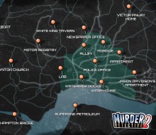
MD2 Game Map
-
Traditional Home
-

The Dockyard CGI
-
Pixlla.com | Website
-
MD2 Promo Video
-
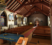
Inside Lynton Church
-
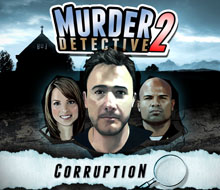
Murder Detective 2: Corruption
-
The Police Headquarters
-
Lynton Church
-
Phil’s House Boat
-

Tournay Software Logo
-
Hampton River
-
Mijnlieff Prototype
-
The Golden Chinese Restaurant
-
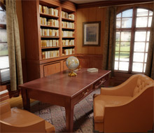
The Study
-
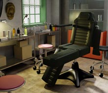
The Tattoo Parlour
-
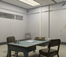
Interrogation Room
-
BattleBallz Chaos
-
Need for Speed Carbon GBA
-
Need for Speed Most Wanted GBA
-
Need for Speed Underground 2 GBA
-
Need for Speed Underground 2 DS
-
Need for Speed Underground GBA
-
Need for Speed Porsche Unleashed GBA
-
TOP GUN FIRESTORM GBA
-

TOP GUN FIRESTORM GBC
-
E.T. The Extra Terrestrial GBC
-
Ultimate Fighting Championship GBC
-
Army Men Air Combat GBC
-
Men in Black 2
-
Sensible World of Soccer ’96/’97 PC
-
Offensive | PC
-
Jungle Strike Amiga
-
Dennis | Amiga
-
Taz-Mania
-
Speedy Gonzales Game Boy